Donation amounts and website donation conversion rates are extremely important to your nonprofit. Many believe that if you can get a donor to your donation page you’ll convert them 100% of the time, but unfortunately, that is not the case. You need great content, pictures, message, security and a user-friendly page to get donors to take that final step and complete their gift. When a donation page visit does not result in a donation, it is an indicator that they had the opportunity to give, but for a variety of reasons chose not to.
Why donors are leaving your page
A few weeks ago, I talked about how to improve conversion rates on your donation page. There is a science to increasing conversion rates and the average donation size, and it comes down to optimizing your donation page correctly. Today I would like to focus on five reasons why donors are not committing to making the donation and choosing to leave your page:
1. No reason to give
For retail stores, simply getting the customer in the door is not going to sell the product. They still have to impress the customer with signage and customer service to get them to purchase their product. When donors arrive at your donation page, if all they find is a blank, generic form, they are likely going to lose interest. Your donation page needs a compelling headline and message, and images that grab their attention. Check out CARE’s donation page, which features a photo of a Syrian refugee. This visual allows donors to connect with the cause they are planning to donate to and tie a face or person to their act of donating.
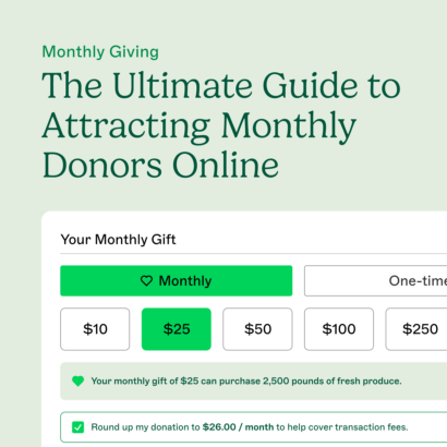
2. Too many fields or choices
If your donation page form is too long, the donor has to take too many steps to completion, or there are too many options to choose from, a donor is going to lose interest and leave your page very quickly. The more fields and options you include, the higher the chances of your visitor becoming confused or frustrated. Collect enough information from your donors to generate meaningful fundraising success reports and future contact information, but keep your forms short and sweet.
3. It is not secure
Online security is becoming a big deal, and with all the news of data breaches and company hacks, rightfully so. When a visitor plans to donate on your page, it is important that they feel secure when submitting that payment. It should be clear to donors that their information is guarded and your page will not put them in a vulnerable financial situation. While they may not be attractive, do not remove security certificates or trust logos that verify it is safe to input information on your site. These forms reassure your donors that they can give to your organization without finding themselves susceptible to identity theft.
4. It is not mobile-friendly
If you haven’t already heard, Google now ranks websites that are mobile-friendly higher on smartphones than sites that are not, but Google is not the only one. Making your donation page and website mobile-friendly will also see positive responses from your donors and visitors, with 75% of customers say they are more likely to return to the site in the future if it is mobile-friendly. Not only will an “unfriendly” site turn away guests, but Google is less likely to promote it – this one is a no-brainer! Upgrade your website to make sure it is mobile user-friendly and test your site across all devices by having your web developer use device detection. Your text should be large and readable without having to zoom in and out, and your links should be large and spaced out, making them easy to tap.
5. You offered the donor a choice to leave
Simply put, you left the door wide open… or maybe you had too many doors. While navigation elements and links to other pages are a great way to get visitors all over your website, if you have too many on your donation page, you increase the odds of a visitor clicking away before they have completed their donation. Your donation page should be focused on the goal of having your donors complete the form to give, and nothing else on your page should distract them from that. There should be no other “doors” on your page unless they click the back button.
So how are your donation page conversion rates looking? I want to see your nonprofit reaching its full potential, but there might be a few mistakes your site is making that is scaring away potential donors. Let’s work together to get your donation page up to speed!